


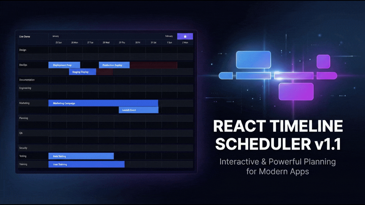
A modern, responsive, and fully customizable timeline scheduler component for React applications. Perfect for project management, resource planning, event scheduling, and more.
Live Demo: Try it here
Author: Pasindu Geevinda
- 📅 Interactive Timeline: Drag to move and resize tasks
- 🎯 Responsive Design: Works on all screen sizes
- 🎨 Fully Themeable: Complete light/dark theme support with customizable colors (Scrollbars, Buttons, Tooltips, etc.)
- ⚡ Performance Optimized: Optimized rendering for large datasets
- ⌨️ Accessible: Keyboard navigation and screen reader support
- 📱 Touch Support: Works on mobile and tablet devices
- 🔧 Configurable: Extensive customization options including Custom Tooltips
npm install react-timeline-scheduler
# or
yarn add react-timeline-scheduler
# or
pnpm add react-timeline-schedulerimport { Timeline } from "react-timeline-scheduler";
import "react-timeline-scheduler/dist/react-timeline-scheduler.css";
const data = [
{
id: "1",
label: "Task 1",
groupLabel: "Group A",
groupId: "group-1",
startDate: new Date(2024, 0, 1),
endDate: new Date(2024, 0, 5),
},
{
id: "2",
label: "Task 2",
groupLabel: "Group B",
groupId: "group-2",
startDate: new Date(2024, 0, 6),
endDate: new Date(2024, 0, 10),
},
];
export function MyTimeline() {
return (
<Timeline
config={{
label: "Project Timeline",
data: data,
}}
/>
);
}<Timeline
config={{
label: "Project Timeline",
data: data,
theme: {
primary: "#3b82f6",
background: { primary: "#ffffff", secondary: "#f8fafc" },
text: { primary: "#1e293b", secondary: "#64748b" },
// See documentation for complete theme options
},
}}
/>import { darkTheme } from "react-timeline-scheduler/dist";
<Timeline
config={{
label: "Project Timeline",
data: data,
theme: {
mode: "dark",
dark: darkTheme,
},
}}
/>;interface SchedulerConfig {
// Required
label: string; // Timeline title/label
data: SchedulerTask[]; // Array of tasks
// Optional
startOffsetDays?: number; // Days to show before first task
endOffsetDays?: number; // Days to show after last task
resources?: string[]; // Resource/group identifiers
styles?: SchedulerConfigStyles; // Style configuration
theme?: SchedulerTheme | SchedulerThemeConfig; // Theme colors
dragConfig?: DragConfig; // Drag and drop settings
disableToolbar?: boolean; // Hide toolbar
animationConfig?: AnimationConfig; // Animation settings
}interface SchedulerTask {
id: string; // Unique identifier
label: string; // Task name
groupLabel: string; // Group/row name
groupId: string; // Group identifier
startDate: Date; // Start date
endDate: Date; // End date
// Optional
variant?: string; // Task variant
progress?: number; // Progress percentage (0-100)
colorKey?: string; // Custom color key
discontinue?: {
// Discontinuous period
startDate: Date;
endDate: Date;
};
extendedStyles?: CSSProperties; // Custom inline styles
// NOTE: tooltipComponent is passed to the Timeline prop, not inside the Task object directly for the config.
}The scheduler includes built-in light and dark themes and supports full customization. See the official documentation for comprehensive theme details.
interface SchedulerTheme {
  primary: string;                  // Primary color
  secondary: string;                // Secondary color

  text: {
    primary: string;                // Primary text
    secondary: string;              // Secondary text
  };

  background: {
    primary: string;                // Main background
    secondary: string;              // Secondary background
  };

  border: string;                   // Border color

  row: {
    even: string;                   // Even row background
    odd: string;                    // Odd row background
    hover: string;                  // Hover state
  };

  grid: {
    color: string;                  // Grid lines
    currentDateLine?: string;       // Today indicator
  };

  header: {
    background: string;
    text: string;
  };

  task: {
    even: string;
    odd: string;
    hover: string;
    text: string;
    border?: string;
  };

  toolbar?: {
    icon?: string;
    background?: string;
    text?: string;
  };

  progressBar?: {
    background?: string;
  };

  // Customization for tooltips and buttons
  tooltip?: {
    background?: string;
    text?: string;
    border?: string;
  };

  buttons?: {
      lock?: { ... },
      today?: { ... }
  };

  resize?: {
    handleBackground?: string;
    handleHoverBackground?: string;
  };

  scrollbar?: {
      thumb?: string;
      thumbHover?: string;
      track?: string;
  };

  interactive?: {
    focus?: string;
  };
}You can provide a tooltipComponent prop to the Timeline to customize the content of the tooltip.
const CustomTooltip = (task) => (
  <div className="custom-tooltip">
    <strong>{task.label}</strong>
    <p>{task.startDate.toLocaleDateString()}</p>
  </div>
);

// ...

<Timeline
    config={...}
    tooltipComponent={CustomTooltip}
/>- Keyboard navigation support
- ARIA labels for screen readers
- High contrast mode support
- Focus indicators on interactive elements
Contributions are welcome! Please see CONTRIBUTING.md for guidelines.
MIT © Pasindu Geevinda