-
Notifications
You must be signed in to change notification settings - Fork 1
Expand file tree
/
Copy pathtutorial.rmd
More file actions
633 lines (426 loc) · 31 KB
/
tutorial.rmd
File metadata and controls
633 lines (426 loc) · 31 KB
1
2
3
4
5
6
7
8
9
10
11
12
13
14
15
16
17
18
19
20
21
22
23
24
25
26
27
28
29
30
31
32
33
34
35
36
37
38
39
40
41
42
43
44
45
46
47
48
49
50
51
52
53
54
55
56
57
58
59
60
61
62
63
64
65
66
67
68
69
70
71
72
73
74
75
76
77
78
79
80
81
82
83
84
85
86
87
88
89
90
91
92
93
94
95
96
97
98
99
100
101
102
103
104
105
106
107
108
109
110
111
112
113
114
115
116
117
118
119
120
121
122
123
124
125
126
127
128
129
130
131
132
133
134
135
136
137
138
139
140
141
142
143
144
145
146
147
148
149
150
151
152
153
154
155
156
157
158
159
160
161
162
163
164
165
166
167
168
169
170
171
172
173
174
175
176
177
178
179
180
181
182
183
184
185
186
187
188
189
190
191
192
193
194
195
196
197
198
199
200
201
202
203
204
205
206
207
208
209
210
211
212
213
214
215
216
217
218
219
220
221
222
223
224
225
226
227
228
229
230
231
232
233
234
235
236
237
238
239
240
241
242
243
244
245
246
247
248
249
250
251
252
253
254
255
256
257
258
259
260
261
262
263
264
265
266
267
268
269
270
271
272
273
274
275
276
277
278
279
280
281
282
283
284
285
286
287
288
289
290
291
292
293
294
295
296
297
298
299
300
301
302
303
304
305
306
307
308
309
310
311
312
313
314
315
316
317
318
319
320
321
322
323
324
325
326
327
328
329
330
331
332
333
334
335
336
337
338
339
340
341
342
343
344
345
346
347
348
349
350
351
352
353
354
355
356
357
358
359
360
361
362
363
364
365
366
367
368
369
370
371
372
373
374
375
376
377
378
379
380
381
382
383
384
385
386
387
388
389
390
391
392
393
394
395
396
397
398
399
400
401
402
403
404
405
406
407
408
409
410
411
412
413
414
415
416
417
418
419
420
421
422
423
424
425
426
427
428
429
430
431
432
433
434
435
436
437
438
439
440
441
442
443
444
445
446
447
448
449
450
451
452
453
454
455
456
457
458
459
460
461
462
463
464
465
466
467
468
469
470
471
472
473
474
475
476
477
478
479
480
481
482
483
484
485
486
487
488
489
490
491
492
493
494
495
496
497
498
499
500
501
502
503
504
505
506
507
508
509
510
511
512
513
514
515
516
517
518
519
520
521
522
523
524
525
526
527
528
529
530
531
532
533
534
535
536
537
538
539
540
541
542
543
544
545
546
547
548
549
550
551
552
553
554
555
556
557
558
559
560
561
562
563
564
565
566
567
568
569
570
571
572
573
574
575
576
577
578
579
580
581
582
583
584
585
586
587
588
589
590
591
592
593
594
595
596
597
598
599
600
601
602
603
604
605
606
607
608
609
610
611
612
613
614
615
616
617
618
619
620
621
622
623
624
625
626
627
628
629
630
631
632
633
---
title: "3 Steps To Become A Data Scientist"
author: "Priyanka Kishore & Alisha Varma"
date: "5/17/2020"
output: rmdformats::readthedown
---
```{r setup, include=FALSE}
knitr::opts_chunk$set(echo = TRUE)
```
# Introduction
So you want to be a Data Scientist and don’t know where to start? Well, you’ve come to the right place.
Today you’ll learn a little about the economy, a whole bunch of data science principles and practice and where to stay on your next trip to New York City!

## Data Science Pipeline
First, let’s look at the data science pipeline.
The data science pipeline starts with defining what major questions one wants to answer and subsequently **_acquiring and importing the relevant data_** to be analyzed.
Then, the data is viewed and **_data tidying_** must occur; where a rectangular data structure model is assumed and three requirements must be met. Each observation (called an entity) forms a row, each variable (called an attribute) forms a column and each observational unit (type of entity) forms a table.
Leading to the exploratory data analysis process, where the data is transformed and visualized. **_Data cleaning_** may be necessary for missing data. When handling missing data, the missing data may be removed, encoded or imputation (replace missing values with the mean of non-missing values) of a numeric variable may be necessary.
Hypothesis testing and machine learning (ML) modeling are the final steps before the data and its results can be communicated.
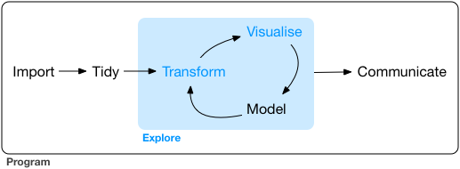
_Source:_ https://r4ds.had.co.nz/explore-intro.html
## Economy & Vacations
The rise of companies like Airbnb has given rise to The Sharing Economy. The sharing economy is a model defined as the facilitation of goods and services on a peer-to-peer level usually through online community platforms. This new model has made it possible for a great deal of people to gain another source of income and for you to have an affordable vacation.
As more [sharing economy companies have opened, like Airbnb and Uber](https://www.forbes.com/sites/tomiogeron/2013/01/23/airbnb-and-the-unstoppable-rise-of-the-share-economy/#40e7cf76aae3), the way we vacation has changed. This change has been documented and open data on it is available.
## DataSet Used
The data we will be using in this tutorial is [_New York City Airbnb Open Data_](http://www.kaggle.com/dgomonov/new-york-city-airbnb-open-data/data) from Kaggle. We will use this data to look at the relationships between types of housing and location.
# Preparing Data
Download the [dataset](https://www.kaggle.com/dgomonov/new-york-city-airbnb-open-data?select=AB_NYC_2019.csv).
In this section, we will learn how to load in our dataset, view the data in our dataset, and clean it up so it's easy for us to work with.
First, let's load in the following libraries so we can use certain functions:
```{r, message=FALSE}
# for data wranging
library(tidyverse)
library(dplyr)
# for data analysis
library(geosphere)
library(ggplot2)
library(broom)
```
## Loading Data
CSV files are files that include data which are "comma-separated values", meaning that data values are literally separated by commas.
After we've downloaded our CSV file from Kaggle into our working directory, we can use the `read_csv` function to load the CSV file data into our program's data frame, which is a table of the data.
```{r, message=FALSE}
# create a dataframe from our CSV file
airbnb_tab <- read.csv("AB_NYC_2019.csv", header=TRUE)
```
There are some attributes that we don't need for our purposes, like `host_id`, `host_name`, `minimum_nights`, `number_of_reviews`, `last_review`, `reviews_per_month`, and `calculated_host_listings_count`. So, let's remove these from our data frame:
```{r}
# a vector called "to_remove" that has the names of the attributes we don't want
to_remove <- c('host_id',
'host_name',
'minimum_nights',
'number_of_reviews',
'last_review',
'reviews_per_month',
'calculated_host_listings_count')
# removing attributes from data frame using "to_remove"
airbnb_tab = airbnb_tab[ , !(names(airbnb_tab) %in% to_remove)]
```
## Viewing Data
Here, we see the first 10 rows in our dataset:
```{r}
knitr::kable(head(airbnb_tab, n=10))
```
Some Notes:
* `knitr::kable()` is used to make the table "pretty" and easier to read
* `head(df, n=10)` is used to view the dataframe with a specific number of rows (head() is not always necessary, you can just list the data frame for it to render)
* the first argument is where the dataframe goes, in this case, `airbnb_tab`
* n = determines the number of rows visible, in this case, 10
The following is a list of descriptions for the attributes of our data set:
Attribute | Description/Unit
------------ | -------------
`id` | Unique ID for each Airbnb listing
`name` | Name or description of the Airbnb listing
`neighbourhood_group` | Boroughs of New York (Manhattan, Brooklyn, Queens, Bronx, Staten Island)
`neighbourhood` | Neighborhoods of New York
`latitude` | Degrees of latitude, measures distance North and South from Equator
`longitude` | Degrees of longitude, measure distance East and West of Prime Meridian
`room_type` | Type of space offered (Entire home/apt, Private room, Shared room)
`price` | Price of listing, in US Dollars
`availability_365` | Number of days in a year when the listing is available for booking
## Tidying Data
Tidying Data entails the elements listed in the list below.
Elements of a tidy dataset:
1. Each observation/entity forms a row
2. Each variable/attribute forms a column
3. Each observational unit (type of entity) forms a column (i.e. not dependent on one another)
Our dataset is already tidy and meets the criteria above. Each entity is a row and each attribute is a column, where no entity is dependent on another.
However, if your data set is untidy, below is an example on a different small dataset, to show you what to do.
### Sample Tidying
Let's tidy up this small [messy-airlines.csv](messy-airlines.csv) dataset containing data about the arrival status of two airlines across five destinations.
```{r}
airline_schedule <- read.csv("messy-airlines.csv", header=TRUE) # read downloaded CSV file into a dataframe (array of data)
knitr::kable(airline_schedule)
```
Let's **rename** the first 2 columns from "X" to "airline" and "X.1" to "status" in order to clarify what the values are representing:
```{r}
airline_schedule = rename(airline_schedule, c("airline"="X", "status"="X.1"))
knitr::kable(airline_schedule)
```
Now, notice that there are data values are the headers for the rest of the columns, e.g. Los Angeles, Phoenix, San Diego, San Francisco, and Seattle! We have to make sure that column headers are only variable names that describe the values, otherwise, the dataset is considered "untidy".
1. **Create a new column called "destination" to describe where each airline is heading.** We use the `gather` dplyr function, which takes a set of column names and places them into a single key column, "destination", and collects the cells of those columns into a single value column, "count".
2. **Make values of "status" attribute as their own attributes.** We do this in order to decrease the number of entries containing the same airline and destination information. We use the `spread` dplyr function, which does the inverse of `gather` by spreading columns, "status" and "count", into separate columns.
3. **Get rid of the full stop (.) in destination names for readability.** We use the `mutate` function to modify the destination column. We are reassigning all the values in the "destination" column to values without the full stop character in city names, ie. "Los.Angeles" to "Los Angeles". We use the `gsub` function for pattern matching with regular expressions (regex) and replaces all occurrences of the full stop character with a space character.
4. **Rearrange the entities to sort by destination first, and then airlines.** The `arrange` function helps us with this.
```{r}
tidy_data <- gather(airline_schedule, "destination", "count", 3:7) %>% # Step 1
spread(status, count) %>% # Step 2
mutate(destination=gsub("\\.", " ", destination)) %>% # Step 3
arrange(destination, airline) # Step 4
knitr::kable(tidy_data)
```
Now this data is tidy!
Remember to avoid these common problems that is found with messy data:
* column headers are values, not variable names
* multiple variables stored in one column
* variables stored in both rows and columns
* multiple types of observational units are stored in the same table
* single observational unit stored in multiple tables
You can read more about how to fix these problems at [CMSC 320 Tidying Data Lecture Notes](https://www.hcbravo.org/IntroDataSci/bookdown-notes/tidying-data.html) by Professor Hector Corrada Bravo.
# Exploratory Data Analysis
In this section, we begin exploring what our data can tell us using *visualizations*. This will help us to better understand our data and help us make decisions about how we may want to further manipulate the data to see something specific, or decide which methods are best for modelling and Machine Learning!
The main reason for exploratory data analysis, or EDA, is to help us find any problems in our data preparation and gain a sense of variable properties, such as central trends (mean), spread (variance), skew, outliers, and relationships between pairs of variables, like their correlation or covariance.
You can read more about EDA at [CMSC 320 EDA Lecture Notes](https://www.hcbravo.org/IntroDataSci/bookdown-notes/exploratory-data-analysis-visualization.html) by Professor Hector Corrado Bravo.
## Handling Missing Data
Recall that the attribute `availability_365` tells us how many days in the year that this particular listing is available for people to book.
Notice that 0 is a value for some of the entities (Airbnb listings). It doesn't make much sense for us to look at entities that aren't available at all during the year. In fact, more than 17000 entities are listed at being available for 0 days out of the year! That's about 1/3 of our dataset.
We'll call this "missing data", and remove these entities from our dataset:
```{r}
airbnb_tab <- airbnb_tab %>%
filter(availability_365 > 0) # filter() is used to filter the dataframe via specific conditions
knitr::kable(head(airbnb_tab, n=10))
```
Note that a way to handle missing data, as mentioned in the data science pipline section (data cleaning), is removing missing data altogether. Having 0 as a value for `availability_365` is a form of missing data.
## Data Visualizations
_What are data visualizations?_ [Data visualizations](https://www.import.io/post/what-is-data-visualization/) are representations of data and/or information in visual format (like a graph or chart). These visualizations allow for patterns and larger data to be presented and communicated straightforwardly. Data is used to gain insight and is valuable so the way it’s presented is important. Humans are visual, it’s how the brain works!
There are many [different forms of data visualization](https://towardsdatascience.com/10-viz-every-ds-should-know-4e4118f26fc3), each of which have their own advantages.
The types of data to be analyzed (categorical and/or numeric) is an important factor in deciding what data visualization is applicable and pertinent.
Want to know more about picking the best data visualization for your message, [click here](https://www.datapine.com/blog/how-to-choose-the-right-data-visualization-types/).
### Interactive Map
Another layer of data visualizations is the addition of interactions. Interactive data visulizations add more functionality and allow the users to learn more about the massive amounts of data presented and the data its relationship relative to itself.
There are many types of interactive data visualizations and each type has there own benefits. [Here](https://blog.hubspot.com/marketing/great-data-visualization-examples) are some examples of captivating visualizations and how they are effective.
Let's _first_ create the map using the `leaflet` package. The map will be centered in NYC.
```{r}
# Download necessary library to integrate and control maps
library(leaflet)
# Creating NYC Map
nyc_map <- leaflet(airbnb_tab) %>%
addTiles() %>%
setView(
lat=40.730610, #set latitude of NYC
lng=-73.935242, #set longitude of NYC
zoom=11)
nyc_map #outputs the map
```
Now, let's add our data via location icons. The latitude and longitude coordinate for each listing will be used for icon placement on the map.
```{r}
leaflet(airbnb_tab) %>% #pass in
addTiles() %>%
addAwesomeMarkers(
#pass in given longitude of entity
lng = ~longitude,
#pass in given latitude of entity
lat = ~latitude,
# Setting up icon for entity on map
icon = awesomeIcons(
icon = 'ios-close',
iconColor = 'black',
library = 'ion',
# Determines color of the icon on map with nested if else statements
markerColor = ~ifelse(room_type == 'Entire home/apt', "green",
ifelse(room_type =='Private room', "orange",
"red"
)
)
),
# Price Label
label = ~paste("$", as.character(price), "per night"),
# Clustering for identifying arrest density
clusterOptions = markerClusterOptions()
) %>%
addLegend(
position = 'bottomright',
# Color keys correspond to values, respectively
colors= c("green", "orange", "red"), labels=c("Entire Home/Apt", "Private Room", "Shared Room"),
title='Types of Rentals',
)
```
* The icon color is dependent on the `room_type` attribute that has three categories; enitre home or appt. is green, private rooms are orange and shared rooms are red. Another functionality is that the icons have labels when they are hovered over, the labels contain the price of the listing as to contribute to the ease of viewing and comparing listings.
* The map contains a legend so that the user knows how to interpret the map's colors.
* A clustering function was added and can be omitted, it was just added for density analysis based on coordinates of listing on the map.
This map could help you plan your next trip to NYC and save money just by staying across the street. Who knew!
### Boxplots
Boxplots, although simple, are very useful to view the relationship of numeric variables relationship of numeric variables relative to each other, creating insight into the range and stats of the data. If multiple boxplots are used, we can view the relationship between the categorical and numeric attributes, as well.
Here we look at the complete range listing prices based on the `room_type` attribute in the dataset. We will split up the listing and look at them subsequently to see how their ranges compare to one another.
The three step process is:
1. Filter the data into a new dataframe based on the room type
2. Graph the data via a boxplot
3. Section off the y-axis range of the boxplot _to create an effective and interpretable visulization_
_Purpose:_ We want to see the listing's price ranges of places based on neighborhood groups, to see how they compare to one another. (We will separate the data by room type, as the price for an entire house versus a shared room on the same street will vary greatly.)
**_First_, let's graph the Entire home/appt. room type.**
We filter the data.
```{r, warning=FALSE}
# Download subsequent libraries
library(ggplot2) #data visualization package for the statistical programming
library(ggthemes) #package for themes
# Filter out all the Enitre home/appt listings into new dataframe
airbnb_home <- airbnb_tab %>%
filter(room_type == 'Entire home/apt')
# View new table
knitr::kable(head(airbnb_home, n=10))
```
Now, we create a boxplot to see the range:
```{r}
airbnb_home %>% #send in dataframe
# Setting up what data is used from the dataframe
ggplot(aes(x = neighbourhood_group, y = price)) +
geom_boxplot()+ #creating a boxplot
coord_flip() + #flipping the coordinates to have horizontal view
# Themes for graph
theme_economist() +
scale_fill_economist() +
# Setting up title and axis labels
labs(title = "Entire Homes & Appts. Price By Neighborhood in 2019",
x = "Major Neighborhood Groups",
y = "Price(USD)")
```
These boxplots are ineffective as the data is hardly viewable, since the outliers are so far out of the range. So what do we do?
We now filter the range of y-axis accordingly to make the visulaization useful. While some outliers will be cut off, the heart of our data is still present, and limiting of the range does not disrupt the purpose of this visualization.
```{r, warning = FALSE}
airbnb_home %>% #send in dataframe
# Setting up what data is used from the dataframe
ggplot(aes(x = neighbourhood_group, y = price)) +
geom_boxplot()+ #creating a boxplot
# Limiting the y-axis to get a better view of data
scale_y_continuous(limits = c(0, 1500)) +
coord_flip() + #flipping the coordinates to have horizontal view
# Themes for graph
theme_economist() +
scale_fill_economist() +
# Setting up title and axis labels
labs(title = "2019 NYC Homes & Appts. Prices (Up to $1500/night)",
x = "Major Neighborhood Groups",
y = "Price(USD)")
```
Here we have it! A visualization that shows the price ranges of listing of entire homes and apartments, by neighboorhood groups.
Let's hope you're not getting ripped off.
**_Second_, let's graph the Private room type.**
We filter the data, again, into a new dataframe:
```{r}
# Filter out all the Private room listings into new dataframe
airbnb_room <- airbnb_tab %>%
filter(room_type == 'Private room')
# View new table
knitr::kable(head(airbnb_room, n=10))
```
Again, we create a boxplot to see the range:
```{r}
airbnb_room %>% #send in dataframe
# Setting up what data is used from the dataframe
ggplot(aes(x = neighbourhood_group, y = price)) +
geom_boxplot()+ #creating a boxplot
coord_flip() + #flipping the coordinates to have horizontal view
# Themes for graph
theme_economist() +
scale_fill_economist() +
# Setting up title and axis labels
labs(title = "Private Room Price By Neighborhood in 2019",
x = "Major Neighborhood Groups",
y = "Price(USD)")
```
These boxplots are ineffective as well.
So this time, we pull in the range of y, even more and reduce it down to 500 dollars, as private rooms usually cost much less per night than entire homes.
```{r, warning = FALSE}
airbnb_room %>% #send in dataframe
# Setting up what data is used from the dataframe
ggplot(aes(x = neighbourhood_group, y = price)) +
geom_boxplot()+ #creating a boxplot
# Limiting the y-axis to get a better view of data
scale_y_continuous(limits = c(0, 500)) +
coord_flip() + #flipping the coordinates to have horizontal view
# Themes for graph
theme_economist() +
scale_fill_economist() +
# Setting up title and axis labels
labs(title = "2019 NYC Private Room Prices (Up to $500/night)",
x = "Major Neighborhood Groups",
y = "Price(USD)")
```
Now this graph is much more effective than the previous one.
We're almost done, just one more to go.
**_Lastly_, lets graph the Shared room type**
We filter the data for the last time:
```{r}
# Filter out all the Shared room listings into new dataframe
airbnb_sroom <- airbnb_tab %>%
filter(room_type == 'Shared room')
# View new table
knitr::kable(head(airbnb_sroom, n=10))
```
Again, we create a boxplot to see the range:
```{r}
airbnb_sroom %>% #send in dataframe
# Setting up what data is used from the dataframe
ggplot(aes(x = neighbourhood_group, y = price)) +
geom_boxplot()+ #creating a boxplot
coord_flip() + #flipping the coordinates to have horizontal view
# Themes for graph
theme_economist() +
scale_fill_economist() +
# Setting up title and axis labels
labs(title = "Shared Room Price By Neighborhood in 2019",
x = "Major Neighborhood Groups",
y = "Price(USD)")
```
And again the y-axis values need to be trimmed. This time we will trim it down to $200.
```{r, warning = FALSE}
airbnb_sroom %>% #send in dataframe
# Setting up what data is used from the dataframe
ggplot(aes(x = neighbourhood_group, y = price)) +
geom_boxplot()+ #creating a boxplot
# Limiting the y-axis to get a better view of data
scale_y_continuous(limits = c(0, 200)) +
coord_flip() + #flipping the coordinates to have horizontal view
# Themes for graph
theme_economist() +
scale_fill_economist() +
# Setting up title and axis labels
labs(title = "2019 NYC Shared Room Prices (Up to $200/night)",
x = "Major Neighborhood Groups",
y = "Price(USD)")
```
We're all done now. *So what have we learned?*
We learned that Manhattan has the pricest listing independent of the room type of the listing. What other conclusions can we make from these visualizations?
# Hypothesis Testing & Machine Learning
**What is Hypothesis Testing?**
Okay, so we have data. But what does it all mean? We need to first interpret our data to make assumptions about it, and test if our assumptions are valid! We refer to an assumption as a "hypothesis". Conducting "hypothesis testing" will help us quantify the validity of our assumptions to certain questions about the data ([Machine Learning Mastery](https://machinelearningmastery.com/statistical-hypothesis-tests/)).
To conduct hypothesis testing, we will first plot linear regressions over the distribution of our dataset and generate statistics about the regressions. These statistics will help us answer questions about the data!
**What is Machine Learning?**
We’ve all heard of it, but what is it really? Machine learning uses algorithms and statistics in order to find patterns in substantial amounts of data (meaning anything that can be digitally stored). In machine learning, a model is created using mathematical and statistical functions that are able to be modified ([either manually or automatically, dependent on the type of ML](https://www.zdnet.com/article/what-is-machine-learning-everything-you-need-to-know/)) till it can make accurate predictions with new data.
Linear and logistic regressions are both machine learning algorithms, one based on supervised regression and the other is based on supervised classification, respectively.
The patterns found are usually used for recommendation systems in many of [today’s technologies](https://builtin.com/artificial-intelligence/machine-learning-examples-applications).
## ML & Hypothesis Testing Walk Through
With datasets that are large, it can be very useful to generate a linear regression, or a line of "best fit", for an easier interpretation of the data. This data analysis technique is also an effective way to learn about general trends of our data set and lets us construct confidence intervals and do hypothesis testing, which analyzes and tests for relationships between variables.
We want to look at the relationship between price and distance away from Times Square in New York City, one of the largest populated cities in New York. We are looking at Time Square since it is a major commercial intersection, tourist destination, entertainment center, and neighborhood in the Midtown Manhattan section of NYC ([Wikipedia](https://en.wikipedia.org/wiki/Times_Square)).
For these reasons, we would like to see if Airbnb listings would increase as their distance to Times Square (latitude 40.757, longitude -73.986) decreases, and vice versa. We will be using functions from the `geosphere` library to calculate distance between coordinates.
**First**, let's add an attribute called `distToTimesSquare` in our dataset. This will contain the distance (in miles) between each listing and Times Square.
```{r}
coordsTimeSquare <- c(-73.986, 40.757) # vector of Times Square coordinates, first longitude, second latitude
airbnb_tab <- airbnb_tab %>%
mutate(distToTimesSquare = by(airbnb_tab, 1:nrow(airbnb_tab), # calculate distance using distHaversine function
function(row) {
distHaversine(c(row$longitude, row$latitude), coordsTimeSquare)
}) / 1609) # divide by 1609 to convert meters to miles
knitr::kable(head(airbnb_tab))
```
**Second**, let's split our current `airbnb_tab` data frame into two data frames, one with `room_type == "Entire home/apt"` and one with `room_type == "Private room"`. This is because prices are much more expensive for "Entire home/apt" listings, so we don't want to get confused when regressing against distance. We only want to see the relation between distance and prices, not between prices and size of the space being listed!
```{r}
# create new dataframe of listings where room_type=="Entire home/apt"
entire_tab <- airbnb_tab %>%
filter(room_type == "Entire home/apt")
# create new dataframe of listings where room_type=="Private room"
private_tab <- airbnb_tab %>%
filter(room_type == "Private room")
# create new dataframe of listings where room_type=="Shared room"
shared_tab <- airbnb_tab %>%
filter(room_type == "Shared room")
knitr::kable(head(entire_tab))
knitr::kable(head(private_tab))
knitr::kable(head(shared_tab))
```
**Third**, we want to create a scatter plot of the prices of listings against their distance to Times Square. We'll also add a regression line to this scatter plot to the general increasing or decreasing trend in our data! Let's do this three times, once for each room_type we are interested in.
```{r, warning=FALSE}
entire_tab %>%
ggplot(aes(x=entire_tab$distToTimesSquare,y=entire_tab$price)) +
geom_point() + # plot points for scatter plot
geom_smooth(method=lm) + # plot linear regression line or line of best fit
ylim(0, 1500) + # set the upper limit of prices to $1500
labs(title="Homes & Appts. Prices vs Distance to Times Square", x="Distance to Times Square (miles)", y="Price (USD)")
private_tab %>%
ggplot(aes(x=private_tab$distToTimesSquare,y=private_tab$price)) +
geom_point() + # plot points for scatter plot
geom_smooth(method=lm) + # plot linear regression line or line of best fit
ylim(0, 500) + # set the upper limit of prices to $500
labs(title="Private Room Prices vs Distance to Times Square", x="Distance to Times Square (miles)", y="Price (USD)")
shared_tab %>%
ggplot(aes(x=shared_tab$distToTimesSquare,y=shared_tab$price)) +
geom_point() + # plot points for scatter plot
geom_smooth(method=lm) + # plot linear regression line or line of best fit
ylim(0, 200) + # set the upper limit of prices to $200
labs(title="Shared Room Prices vs Distance to Times Square", x="Distance to Times Square (miles)", y="Price (USD)")
```
**Lastly**, let's analyze the resulting models quantitatively using `broom::tidy`.
```{r}
entire_fit <- lm(distToTimesSquare~price, data=entire_tab) # create the simple regression model
entire_fit %>%
tidy() # turn model into a tibble with information about the model
private_fit <- lm(distToTimesSquare~price, data=private_tab) # create the simple regression model
private_fit %>%
tidy() # turn model into a tibble with information about the model
shared_fit <- lm(distToTimesSquare~price, data=shared_tab) # create the simple regression model
shared_fit %>%
tidy() # turn model into a tibble with information about the model
```
As we can see in all three of these linear regression plots, **the prices of all the types of listing decreases slowly as the location of the listing gets further away from Times Square**. From the models, it is clear that prices of Airbnb listings decrease by 0.00149 (homes and apts), 0.00237 (private rooms), and 0.00555 (shared rooms) on average each mile further away from Times Square.
Even though we can clearly see a trend in our linear regressions, it is best to conduct **hypothesis testing** in order to determine if our results are valid and there is a significantly meaningful relationship between Airbnb prices and their distance away from high traffic locations, such as Times Square in New York City ([Statistics How To](https://www.statisticshowto.com/probability-and-statistics/hypothesis-testing/)).
Let's ask the question: *Do we reject the null hypothesis of no relationship between price and distance from Times Square?*
Our answer: Yes, we reject the null hypothesis since the p-values for all three linear regressions are significantly smaller than 0.05. A p-value less than or equal to 0.05 means that the results for our data holds, that our data is repeatable, and that our results didn't just happen by chance ([Statistics How To](https://www.statisticshowto.com/probability-and-statistics/hypothesis-testing/)).
You can read more about Linear Regression at [CMSC 320 Linear Regression Lecture Notes](https://www.hcbravo.org/IntroDataSci/bookdown-notes/linear-regression.html#simple-regression) by Professor Hector Corrada Bravo.
# Conclusion
Through this dataset of 2019 Airbnb listings in New York City, we can conclude that the distance between a listed Airbnb and a highly populated location, such as Times Square in NYC, is negatively correlated to the listing’s price per night. We saw this through linear regressions and conducting hypothesis tests!
We also saw the price range of listings vary greatly in the five boroughs of NYC (independent of room type) and that room type is directly related to the median pricing listing of rooms in different boroughs in NYC.
In this tutorial, we only have scraped the surface of what we can do with data sets using techniques frequently found in the field of data science. There is so much more to learn! We encourage you to visit the references throughout this tutorial to learn more, and to download and mess with different data sets. You can find data from tjese various repositories and more:
* [Kaggle Datasets](https://www.kaggle.com/datasets)
* [US Government’s Open Data](https://www.data.gov/)
* [World Health Organization](https://www.who.int/gho/database/en/)
* [Scientific Data Repositories](https://www.nature.com/sdata/policies/repositories)
# References
[CMSC 320 Lecture Notes by Hector Corrada Bravo](https://www.hcbravo.org/IntroDataSci/bookdown-notes/)
[Airbnb And The Unstoppable Rise of the Share Economy](https://www.forbes.com/sites/tomiogeron/2013/01/23/airbnb-and-the-unstoppable-rise-of-the-share-economy/#40e7cf76aae3)
[What is Data Visualization and Why is it Important?](https://www.import.io/post/what-is-data-visualization/)
[10 Visualizations Every Data Scientist Should Know](https://towardsdatascience.com/10-viz-every-ds-should-know-4e4118f26fc3)
[How to Choose the Right Data Visualization Types](https://www.datapine.com/blog/how-to-choose-the-right-data-visualization-types/)
[16 Captivating Data Visualization Examples](https://blog.hubspot.com/marketing/great-data-visualization-examples)
[Hypothesis Testing](https://www.statisticshowto.com/probability-and-statistics/hypothesis-testing/)
[15 Machine Learning Examples](https://builtin.com/artificial-intelligence/machine-learning-examples-applications)